A good friend of mine made a suggestion for a painting last night, and it stuck with me today, so I took it on, coming up with the following image.
He’s an emissary for a powerful witch from a game my friend put together. He used to be the avatar of a water deity, but the deity became more powerful replaced this guy with a bigger and better avatar. Having nowhere else to go, he wandered into the witch’s realm, and she gave him a nice cushy job.
The results came together with strangely effortless speed, going from an initial sketch to a final piece in a matter of a few hours. I was so happy with my process and how well it worked to nail the image, I decided to outline it here. So here’s a fairly detailed explanation of the process I used, most of which is becoming standard procedure for me.
First I consulted a couple of Googled frogs & toads for reference, and started the initial sketch.
For the sketch or under-drawing, I lay down a dark background with a bit of texture, usually a scanned paper texture, just to provide some tooth and roughness. Above that, I create a dark Solid Color Adjustment layer. This will be the lineart layer. It’s nice to have it as an adjustment layer because if I want, I can easily change the color of the lines and see the results in real time.
Next, I mask the layer completely (so none of the color shows) and then draw on the mask using black and white. Because I have my stylus set up to flip between fore-and background colors, I can draw and erase without having to call up the eraser tool or flip my stylus upside-down. A click of the stylus button gives switches me between adding to and subtracting from the mask, thus effectively erasing or creating a mark.
 |
||
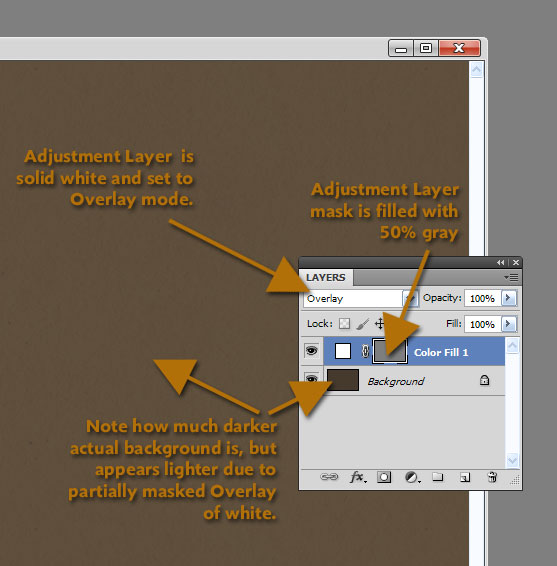
| Fig. 1: Detail of the Solid Color Adjustment layer |
This time, however, I used a masked Solid Color Adjustment layer for my lineart layer as usual, but instead of masking it completely, I filled the mask with a 50% gray and set the color of the layer to white. I then set it to Overlay mode, and went with a much darker background layer than usual. So now the lineart layer is initially lightening the background some: the white is overlaying the dark background, but because it is masked with a 50% gray, it isn’t fully bleaching the layer, resulting in a good neutral tone. (See Fig. 1 for details!)
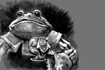 |
| Fig. 2: Lineart layer mask. |
Why this convoluted setup? When drawing on the mask this way, I don’t get just black lines. I can switch between black and white on my stylus button to get either a dark line or a light line, essentially drawing in lights and darks on the same isolated layer. And because it’s an Overlay layer, the line art remains in harmony with the underlying background color.
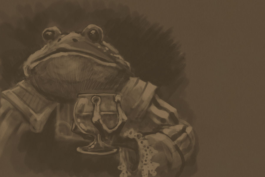 |
| Fig. 3: The drawing or lineart layer. |
Figure 2 shows a screen shot of the actual mask channel for the lineart layer. Note that there is a broad range of tones from black to white in the mask. This was drawn directly into Photoshop, but a similar method could be used by scanning a toned drawing in and using it as a mask in the lineart layer.
Figure 3 shows what the drawing looks like as I’m working on it. Note that the lights and darks are much less stark than they appear in the mask. I like this because it gives me somewhere to build up from, and thus allows me to focus highlights and shadows with more precision later on.
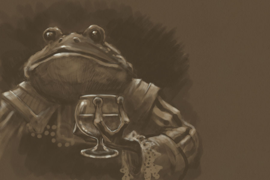 |
| Fig. 4: Beginning to push and pull |
At this point, I’m ready to start a new layer, painting in stronger highlights and deeper shadows. Figure 4 shows the beginnings of this stage. I can see now where I want the most focused lights, accentuating the mouth and glass, with secondary focus on the shoulders and arm.
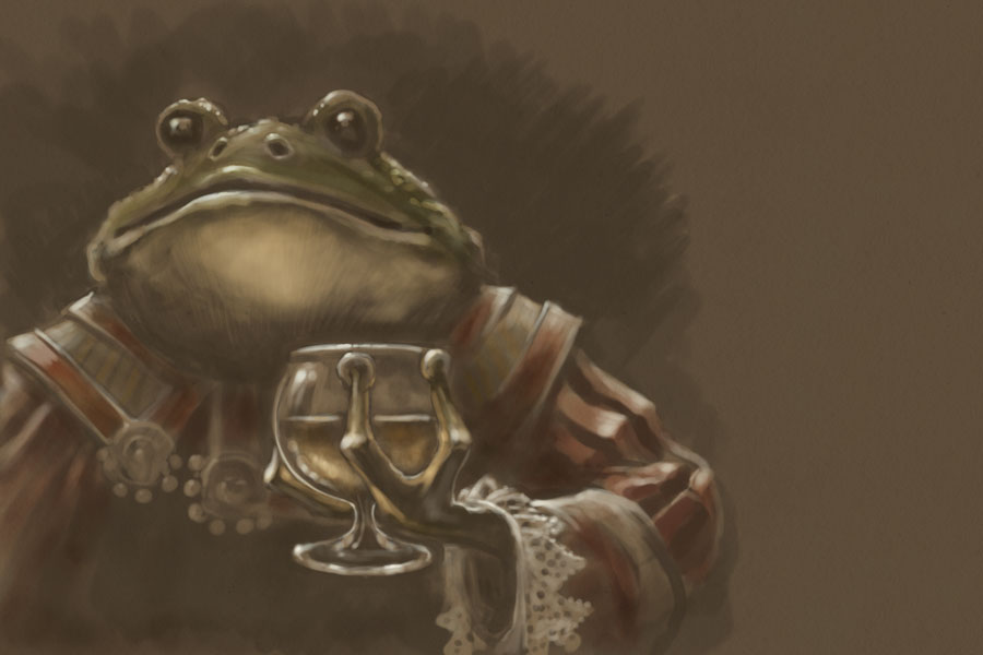 |
| Fig. 4: Timid color. |
Figure 4 shows the timid initial foray into adding color. I usually do this step on Overlay or Soft Light layers, allowing me to slowly build the colors in washes. Taking such a restrained approach keeps some of the background showing through the color, guaranteeing more color unity throughout the piece. It’s an approach that’s similar to the glazing techniques of old master oil painting.
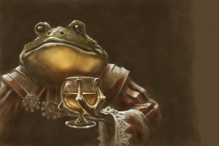 |
| Fig. 5 : Bolder color. |
At this point, I’m getting ideas about where I want the strongest colors, and I go ahead and add richer washes on Overlay layers, pushing the shadows further back and pulling the lights more forward. I also start adding more opaque colors to reinforce those washes, as seen in Figure 5.
After this it was a matter of doing a final detail pass to tighten up a few bits that needed it, then tweaking the Levels and Saturation before saving out the final piece above.
If you’ve read this far, I hope you got something out of this process analysis. And thanks for reading!

thank you for sharing! and the tode looks cool
Big thanks for sharing!
Very cool approach to the lineart. 🙂
And the character is awesome!
/Jonas