I’ve really been neglecting my blog lately, so I’m trying to make up for it with a few posts of work from last year.
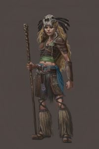
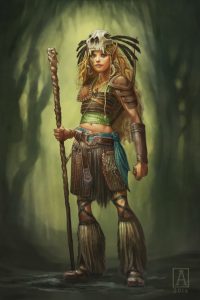
Here’s something I did for a client who wanted a full-length portrait of his Wild Elven Druid character, Kaaovale. She’s young and cheerful, with a shamanic style. My process was pretty straightforward on this one, so I thought I’d quickly share.
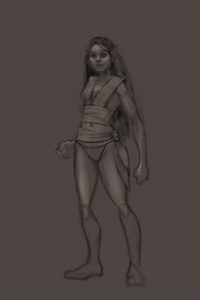
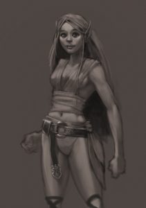
I started as I usually do with a rough black & white. I build this up with a few highlights to establish form and structure.
 |
| Beginning sketch |
 |
| Base layer for greyscale render. |
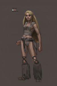
Next, I start laying in some basic colors, using some Soft Light layers and some Overlay layers. I used a very light blue to strengthen the highlights, and a pink and a tan for the skin base. I also add boots and belt. At this point, I’m using about a dozen layers: the base sketch layer, which has been tightened up a bit more, and layers for skin, highlights, and the boots and belt.
 |
| Adding some color notes. |
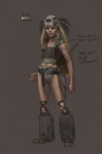
Next I start adding more clothing and gear details. After a consult with the client, he reminds me that she’s a druid, so no metal! I’ve added some pattern to her tunic, some leather armor, tooth earrings, and the super-cool feathered skull headdress.
 |
| Starting to gear up. |
Next, I really go nuts with the clothing and gear, adding pieces on separate layers. I mostly work these up in isolation, so I can toggle them on and off as needed. For example, her bark lames (thigh armor) can be toggled off so I can detail her hairy skirt. I’ll often have a layer for the part, and another layer for the shadow it casts, and then group them together to keep things orderly.
 |
| More gear! More details! |
Finally, I start on some top layers that I use to paint over the entire piece as a whole. This goes a long way toward unifying the piece. I add things like highlights and more hair detail. I also do some color adjustments, usually a Saturation layer to make colors pop.
Because I work totally backwards, I also add the background at this stage. To do this, I create a mask of the character shape, then apply it to the background layers, which is pretty simple because up until now, my background was an even neutral tone, so it’s easy to select, create the mask from the selection, then tweak the edges as needed.
That mask also comes in handy for adding some more dramatic light on the figure. I create a new layer, apply the mask, invert it (so that I’m painting only on the figure now) and hit her with a big soft brush, applying a wash of golden light set to Overlay and low opacity.
 |
| Finished piece. |
