This past year, I’ve had the good fortune to continue working with indie board game designer Ian Brody. His most recent work, produced in collaboration with PSC Games, is Quartermaster General:1914. Based on WW1, it’s a fast-paced and reasonably simple game that offers tremendous replayability. As with other games in the QG line, it offers the spirit of a huge campaign packed into about 90 minutes of play time.
I was the art director and production manager for this title, responsible not just for the game’s illustrations, but all aspects of the graphic design, layout, and file preparation. It was a big job, but really satisfying to watch my artwork and designs end up printed and sold worldwide.
Anyway, here’s the final artwork for the box, minus the logo (yeah, it goes in that huge empty space at the top.)
The basic idea was to engage the viewer in the action, so we see soldiers charging straight for us. I was asked to include a British Mark II tank, and some aeroplanes, so there they are. The original image had the Germans in pickelhuber helmets with the iconic top spike, but was asked to change them for the later “coal scuttle” style helmet. Apparently the Germans phased out the pickelhubers very early in the war, because they were clear targets for snipers. I personally thought the top spike was too iconic to pass up (nothing says WWI more clearly!) but I defer to the judgement of my clients! Here’s a detail of some courageous doughboys charging the German position.
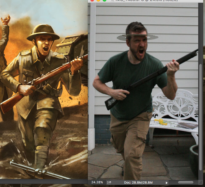
And finally, just for laughs, a really poor reference shot of yours truly, posing in my backyard with a toy musket. I’m also wearing a ridiculous cardboard circle on my head, which I figured would help me place how the doughboy helmet rests on a soldier’s head. Marginally helpful, but very painful to wear!


